
2025 FAO Statistical Yearbook: 10 Key Food & Climate Charts
The UN FAO has released its annual Statistical Yearbook for 2025, featuring data about the food and agriculture system, land use, emissions, and more. Here are the 10 most important charts.
Each year, the UN Food and Agriculture Organization (FAO) publishes a trove of statistics about the global food system, covering everything from protein supply and food security to land use and greenhouse gas emissions.
The Statistical Yearbook is designed as a “primary tool for policymakers, researchers and analysts”, according to the FAO, alongside being a general resource for the agrifood system’s past, present and future paths.
Here are 10 key climate-related charts from the 2025 edition.
1) Greenhouse gas emissions from the food system
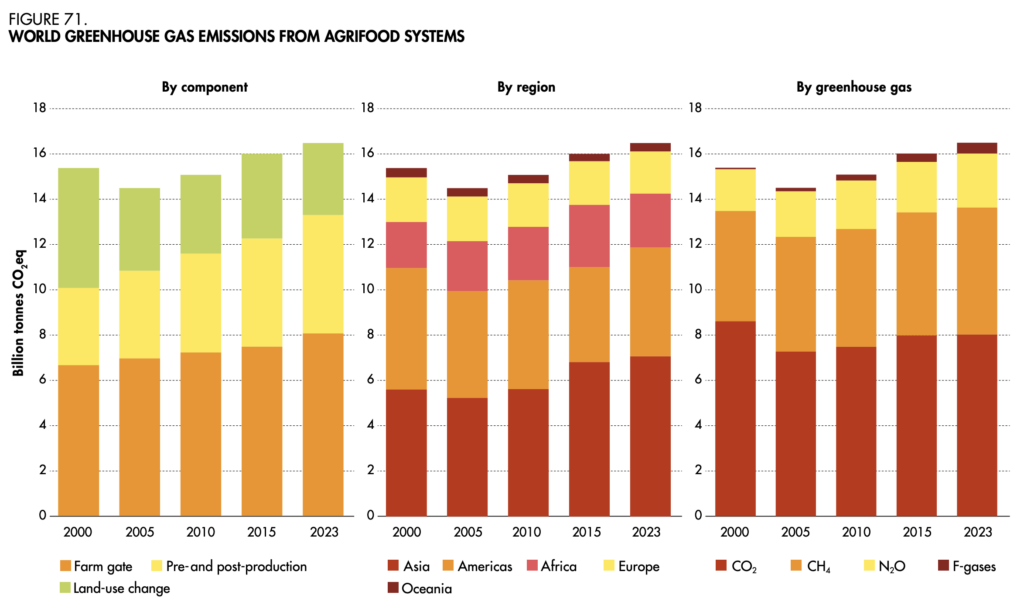
Agrifood emissions grew by 7% between 2000 and 2023, amounting to 16.5 billion tonnes of CO2e, with farm-gate emissions (those related to the production of crops and livestock) responsible for nearly half of this increase. In fact, the latter’s greenhouse gas output was up by 21% in this period, around 53% of which came from livestock alone.
2) Farm-gate emissions by activity
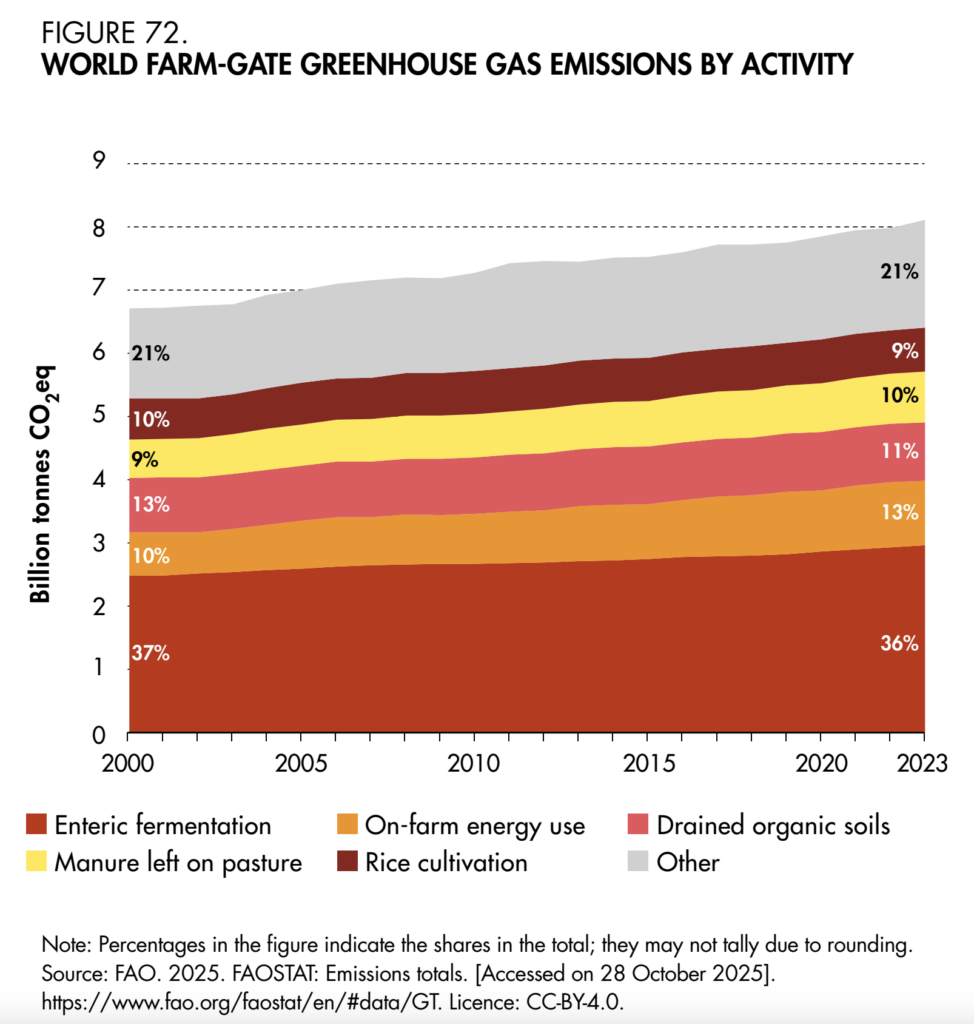
Looking more closely at the farm gate, 36% of the emissions here were a result of enteric fermentation generated in the digestive system of ruminant livestock (which leads to the release of methane). Manure left on pastures leads to another 10% of farm-gate emissions.
3) A global map of agricultural emissions
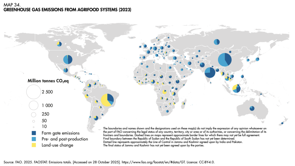
China is, by far, the world’s largest emitter of greenhouse gases from agriculture – producing a total greater than all of Europe, and nearly all of Africa – with pre- and post-production the biggest source. Brazil is second on the list (where land use change is the top source), followed by India (dominated by farm-gate emissions).
4) Global meat production by species
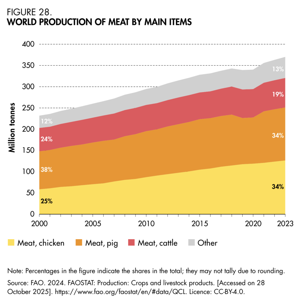
Despite the emissions impact of livestock agriculture, global meat production rose by 60% between 2000 and 2023. And though beef and pork saw increases, they were modest compared to chicken, whose production doubled in this period. Today, chicken and pork each make up 34% of all meat produced, while beef’s share has shrunk by five percentage points to 19%.
5) Global milk production by region
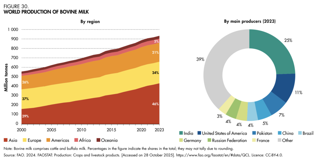
Like meat, the world has also been churning out a lot more milk than it used to. Global cow’s milk output expanded by 68% between the start of the century and 2023, driven by a ramp-up in Asia, whose share of production increased from 29% to 46%. India alone produces a quarter of the world’s milk (hence the high farm-gate emissions), followed by the US (11%), Pakistan (7%), and China (5%).
6) Average protein supply by region
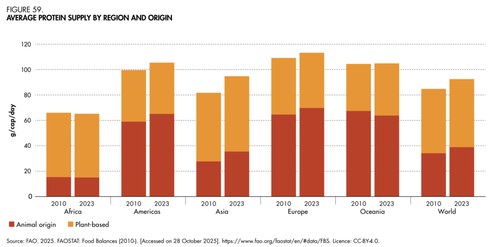
As meat and milk production may have increased, so has their share of the protein supply, which has risen in every region barring Africa and Oceania. Still, animal proteins account for less than 40% of the world’s protein intake – the rest comes from plant-based sources, further highlighting the inefficiencies of the food system.
7) Dietary energy supply by commodity group
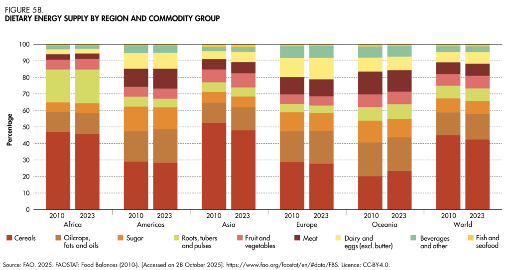
Likewise, meat, seafood, dairy and eggs provide less than a sixth of the total global energy supply (and under 10% of the calories eaten in Africa). Cereals were the most important contributor to dietary energy supply across all regions, followed by oilcrops and fats (in every region except Africa).
8) Global food insecurity levels
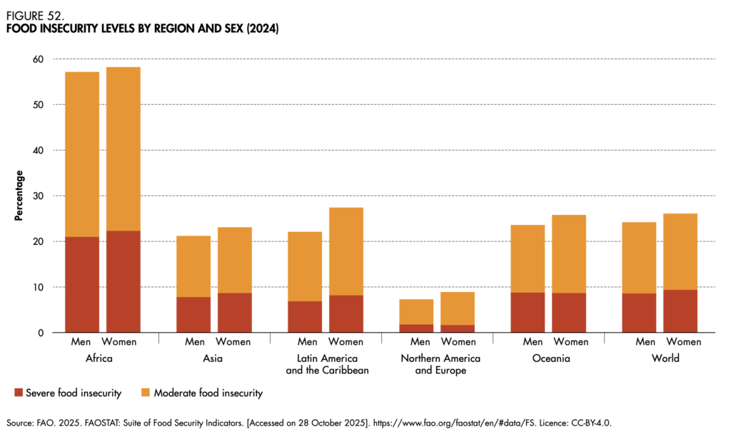
The prevalence of food insecurity is rising everywhere except in North America and Europe, and women are more affected than men in each region, according to the FAO. In 2024, one in 10 people around the world experienced severe food insecurity. And the gender gap is largest in Latin America and the Caribbean (1.3 percentage points for severe insecurity, and 5.3 points for overall hunger).
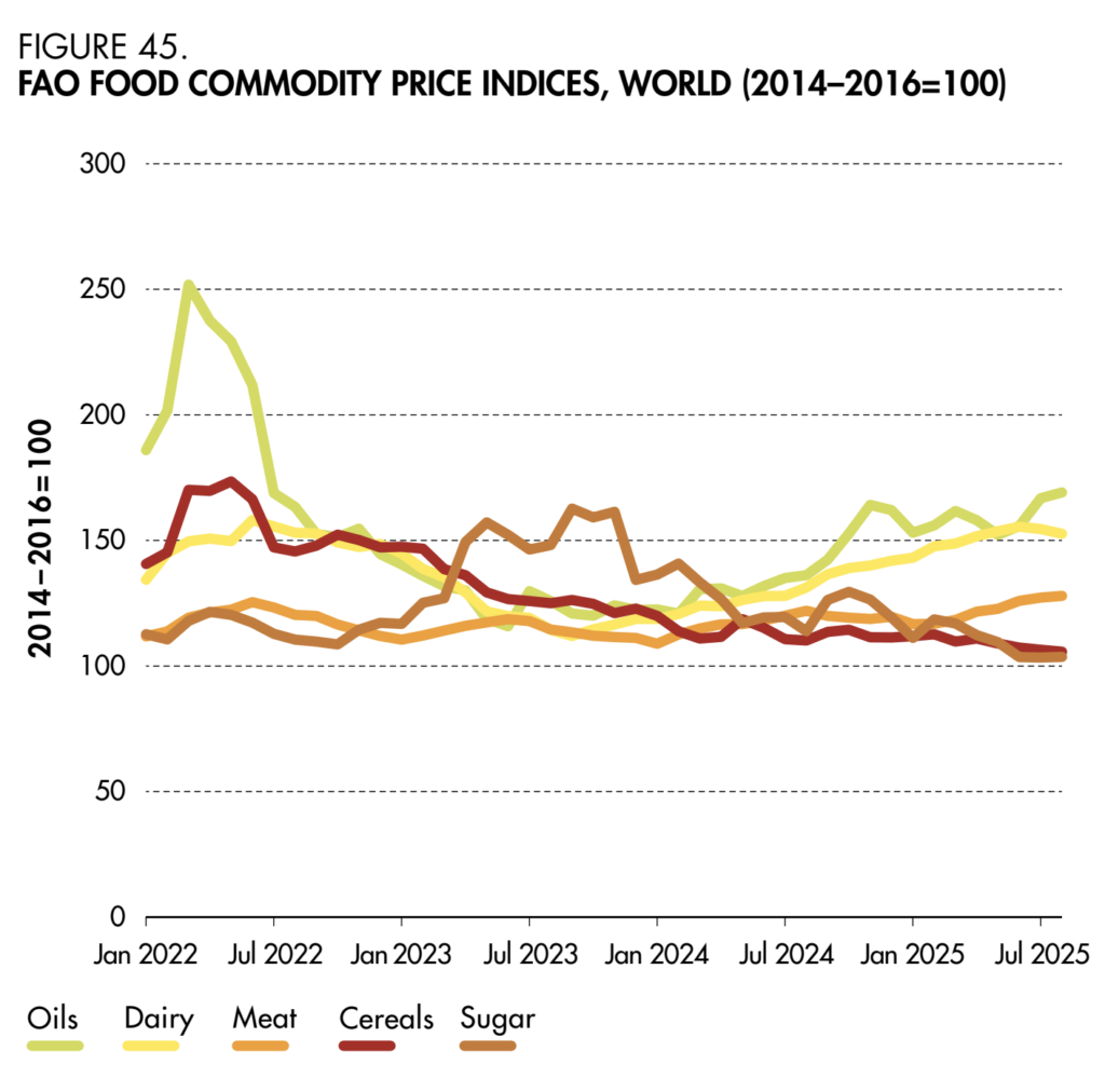
9) Food prices by commodity type
Global food prices have fluctuated greatly since the start of Russia’s war on Ukraine. But when looking at the period between January 2022 and July 2025, the cost of cereals and sugar has actually reduced. On the flip side, meat and dairy prices have shot up in this period, as has the cost of oils.
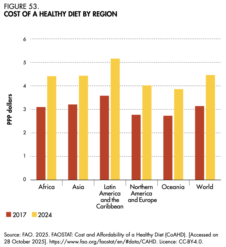
10) The cost of a healthy diet
The FAO defines a healthy diet as one comprising a variety of food groups, adequate in essential nutrients and bioactive compounds, balanced across macronutrients, and moderate in unhealthy components. The average minimum cost of attaining such a diet – a measure of food security and nutrition – increased by 42% between 2017 and 2024. The cost is the steepest in Latin America and the Caribbean, while the proportion of people unable to afford it is highest in Africa.