
With New Red Packaging, Impossible Foods is Leaning Into the ‘Carnivorous Craveability of Meat’
Plant-based meat leader Impossible Foods has unveiled a complete brand refresh, with striking red packaging putting flavour and nutrition front and centre of its products.
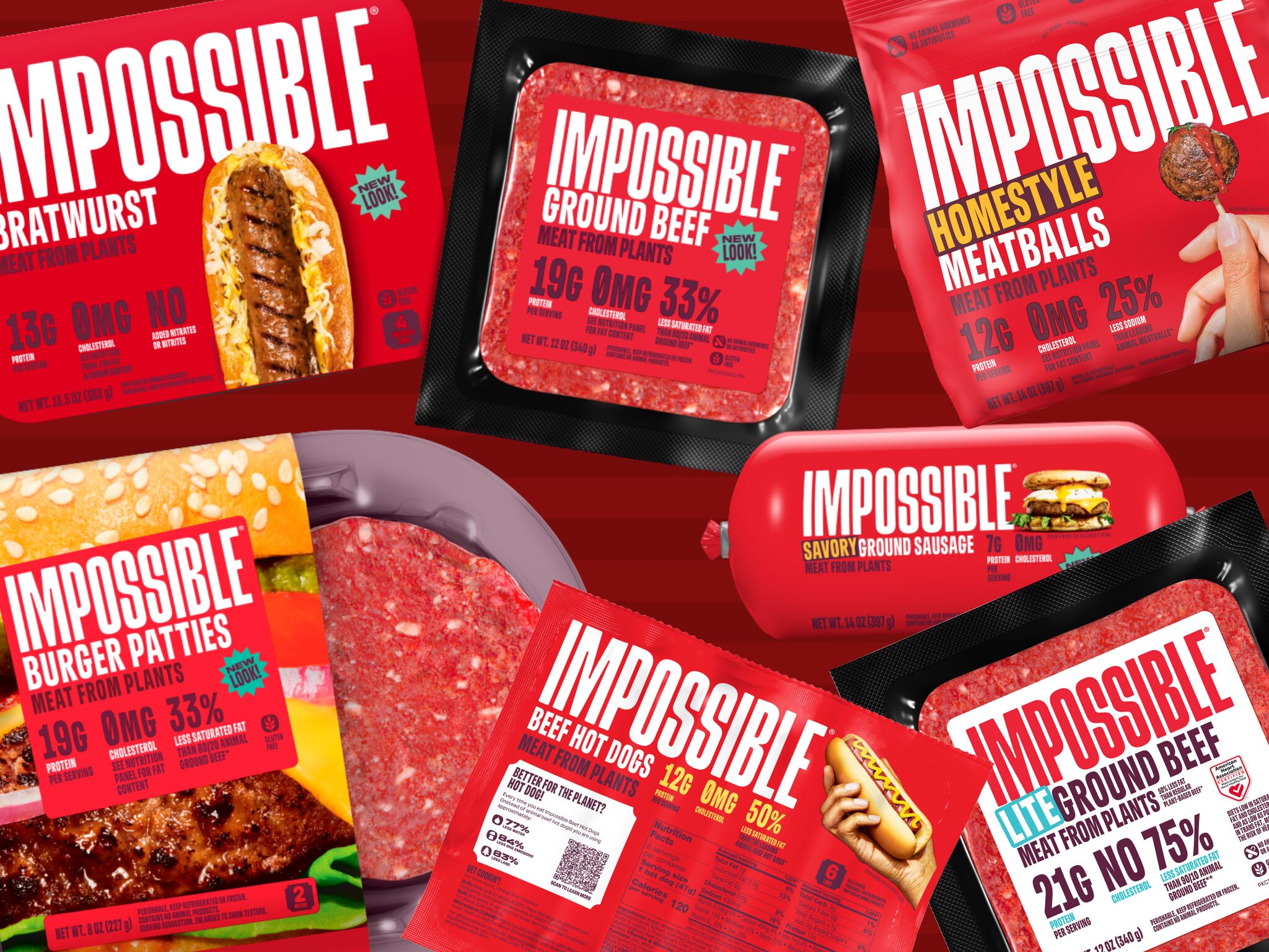
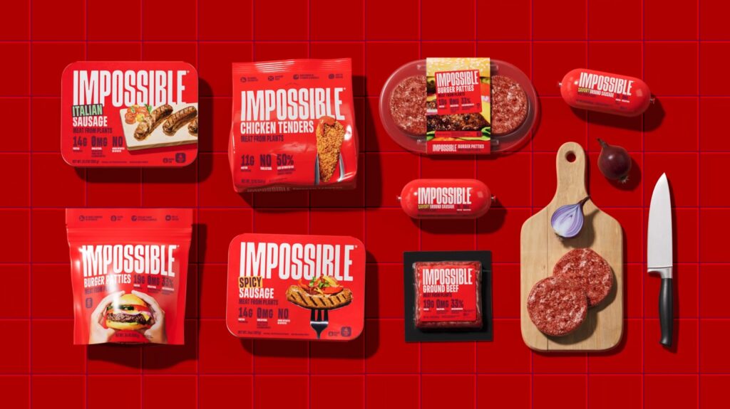
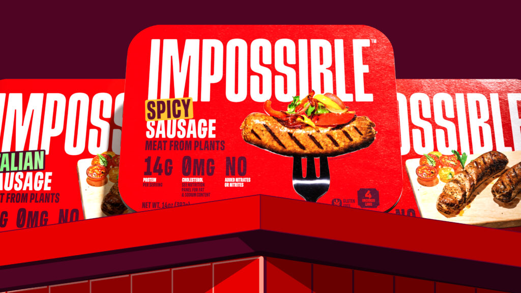
A greater spotlight on taste descriptors, saturated fat and sodium; larger imagery and typography; and a bright-red aesthetic headline the new packaging of Impossible Foods’ meat alternatives.
At Expo West, the Californian company is relaunching its brand identity that puts the spotlight on flavour and nutrition more than ever before, leaning into the results of countless consumer surveys about their plant-based meat preferences. The idea is to appeal to meat-eaters and flexitarians, who make up 90% of Impossible Foods’ customer base, instead of “vegans, vegetarians or those already eating sustainable diets”, as a brand spokesperson explained to Green Queen in December.
The refresh was teased by Impossible Foods CEO Peter McGuinness that month at an Adweek X conference, where he alluded to the fact that existing marketing strategies have pissed Americans off with their “elitism” and “wokeness”. “The way to get meat-eaters to actually buy your product is not to piss them off, vilify them, insult them and judge them,” he explained. “We need to go from insulting to inviting, which is a hell of a journey.”
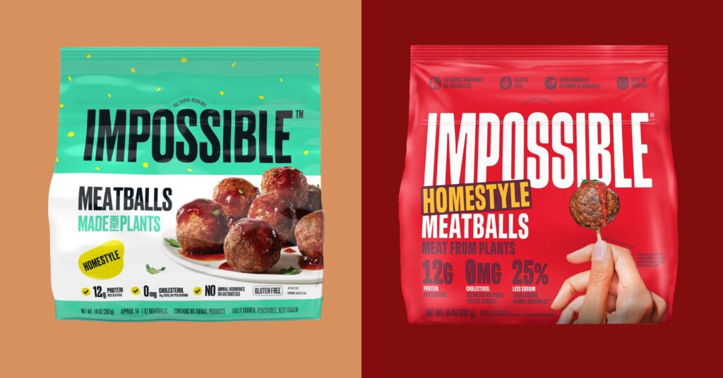
And inviting is exactly the theme of its new packaging, which features more appetising-looking imagery, such as sausages with clearer grill marks and a single meatball showing off more of the product and less of the sauce. Through all this, Impossible Foods wants to push the message that “meat from plants is just as satisfying”.
“We want to be inclusive to anyone who enjoys great food. It doesn’t matter if you’re a vegan, a vegetarian, an animal meat-lover, or somewhere in between,” says McGuinness. “What we want to do is educate consumers that they can still enjoy meat by incorporating into their diet a version that’s made from plants instead of animals.”
If it ain’t broke…
The new brand identity is a result of a collaboration between Impossible Foods’ in-house marketing and creative teams, and global creative agency Jones Knowles Ritchie. The company says it intends to appeal to the “carnivorous cravings of meat-eaters” across the full consumer journey, from the digital experience to the brand’s first impression through packaging.
“We’re not just growing a brand, we’re growing an entire category,” said Leslie Sims, the brand’s chief marketing and creative officer. “For a long time, meat eaters didn’t see us as something for them. But our mission relies on attracting meat eaters, so we wanted to do what we could to be more inviting in our approach and messaging. We’re confident that once they try us, they’ll be in.”
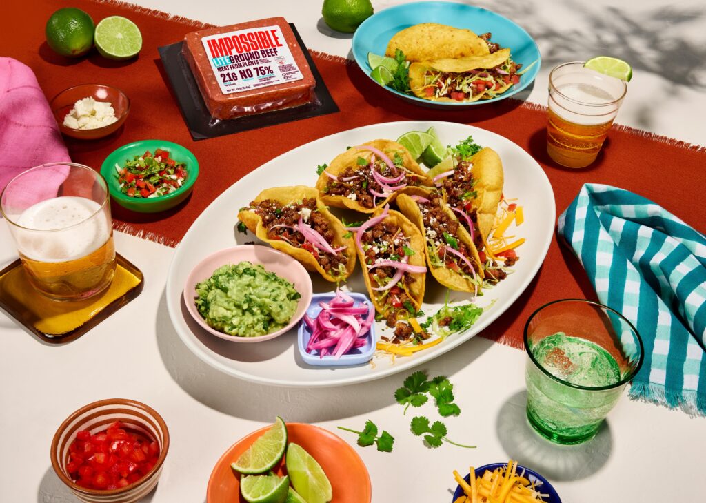
Impossible Foods says it is the fastest-growing plant-based company in the US, which it ascribes to a multitude of factors, including consistently outperforming plant-based competitors on taste, being present in more than 30,000 retail and 45,000 foodservice locations, and having a broad variety of products with nutritional diversities (its portfolio includes an Indulgent Burger as well as ground Beef Lite). Its beef mince is the top-selling plant-based beef in the US across both retail and foodservice, while its meatballs and chicken nuggets are the bestsellers in their respective categories too.
So the question then is: why change what’s working? “Historically, this industry hasn’t spoken directly to meat-eaters, and something as simple as a green brand aesthetic visually reinforced a niche message. As a result, meat from plants has been written off as a vegetarian and vegan phenomenon,” a company spokesperson tells Green Queen.
“That’s why we’re taking this opportunity to expand the public perception and be more inclusive to flexitarian and meat-eating consumers – after all, the more people eating plant-based, the better the planet will be,” they add. “People might be surprised to know that 90% of Impossible consumers also eat meat, and more than one in two who try us for the first time intend to do so again. That means we’re already doing something right, and this evolution of our brand identity is a way for us to build on that success.”
Why Impossible Foods chose red
The company says the bold red colour is designed to “directly mirror the meatiness of our products and the fact they taste, cook and satisfy like meat from animals. It cites a recent ProVeg International study that found 54% of Americans and 56% of Brits associate red packaging for plant-based meat with superior taste.
Alongside green and purple, the research noted that red conveys “delicious flavours and culinary satisfaction”, and showcases “mouthwatering dishes, flavourful ingredients, or chefs’ endorsements”. But while there was a strong association of the colour green with plant-based meat (72% in the UK, 62% in the US), this was down to just 6% and 13%, respectively, for red.
Moreover, green outperformed red in almost all aspects, including health, nutrition and naturalness – crucially, red was the top colour linked with the perception that plant-based meats are tasty in both the UK and the US. However, ProVeg concluded that while packaging influences 65% of consumers’ willingness to buy meat alternatives at least some of the time, red was among the colours that didn’t excite them as much when thinking positively about these products.
But that could be Impossible Foods’ exact point here. As one of the leaders in the plant-based sector, its brand identity is strong enough that a person in a supermarket sees the word ‘Impossible’, and knows it’s plant-based. As the brand has consistently said, though, it wants that person to be a meat-eater. And if they don’t associate red with plant-based meat, that’s a good way to sidestep any preconceptions they may have about the product.
McGuiness expands on this thinking, noting that “it’s a good time to evolve from a position of strength”. “We wanted packaging that lived up to and reflected the deliciousness of our products while really popping on the shelf,” he says.
Taste and nutrition top of mind for Impossible Foods
The new packaging doubles down on the flavour and health credentials of Impossible Foods. As a company that has always been steeped in the environmental benefits of meat alternatives – which is still a huge part of its brand – this reflects its willingness to adapt to consumer trends.
According to a Mintel survey from last year, the top two attributes discouraging Americans from trying plant-based meat are flavour (48%) and nutrition (35%). “Taste is the #1 reason why consumers will decide to purchase a product again or not,” the company told Green Queen in December. That said, health is becoming increasingly crucial, being the main reason six in 10 Americans adopt a meatless diet.
“Our intent with the new packaging – and the overall design of our new brand identity – is to lean into the craveability of meat,” reiterates the spokesperson. “Taste is, of course, a big part of this. Between the bold red aesthetic and new food photography highlighted on the front of each product, we’re deliberately putting the deliciousness of our meat from plants front and centre.”
They added that it’s equally important to Impossible Foods that meat-eaters understand its products are nutritionally competitive with animal-derived meat. “That’s why you’ll see we proudly display on the front of our packaging that Impossible products contain high-quality protein, 0mg cholesterol, and most have at least 25% less saturated fat than their animal counterparts,” they point out.
However, this doesn’t mean the brand is backing away from the sustainability message. “This is and always will be our reason for being, and it’s still featured on our packaging and across various touchpoints of the consumer journey,” the company explains. “However, we realised we can get even more consumers in the door by leading with our incredible taste and nutritional quality – then, we can seal the deal with the environmental benefits. With every converted consumer, we’re able to maximise our positive impact on the planet.”
New packaging aims to be inclusive
The new packaging will hit retail shelves across the US in the coming weeks, before expanding overseas later this year. The first new product to feature the updated red aesthetic will be the soon-to-launch Beef Hot Dog. Asked if this will be accompanied by a marketing campaign, the representative said: “Today is a big step for us, but the work is just beginning.”
The company has been in talks about a Got Milk?-style coalition of plant-based brands to amp up messaging and respond to criticism and negative coverage. Originally slated to launch this year, the plan has suffered setbacks. While there are no updates yet, McGuinness did recently say in a podcast that he believes “there is a collective opportunity to extol the benefits of the category”.
Impossible Foods’ immediate focus will continue to be on luring in new consumers and increasing brand awareness. Currently, only 15% of American households know about the company and its products. “The more welcoming we can be to consumers, the more we and the category stand to grow. That’s where this new brand approach comes into play, and our investment in marketing and advertising more broadly,” the spokesperson explains.
“With every move we make, we want to set the tone that we’re an inclusive brand. We don’t want people to feel judged for loving meat, and we need to show them they don’t have to change their lifestyle in order to help the planet or their health.”